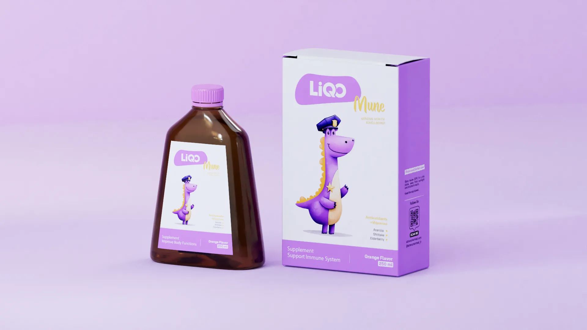
LIQO
A friendlier introduction to children’s supplements.
Packaging · Character design
01 / LIQO
Two audiences
Parents make the purchase, but children use the product. The packaging needed to acknowledge both, with particular attention to the hesitation children often feel around medicine and supplements.
02 / LIQO
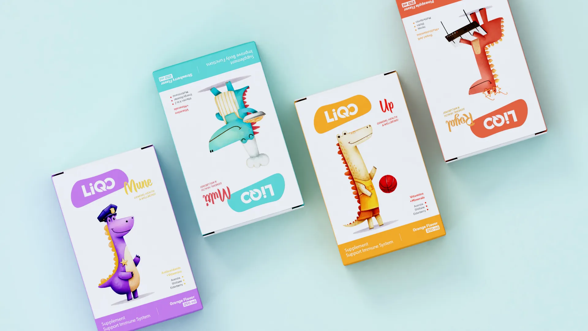
A character for each product
I designed a distinct character for each supplement, taking inspiration from its purpose. Playful scenes, approachable characters and colours chosen for children gave the range a more welcoming personality.
03 / LIQO
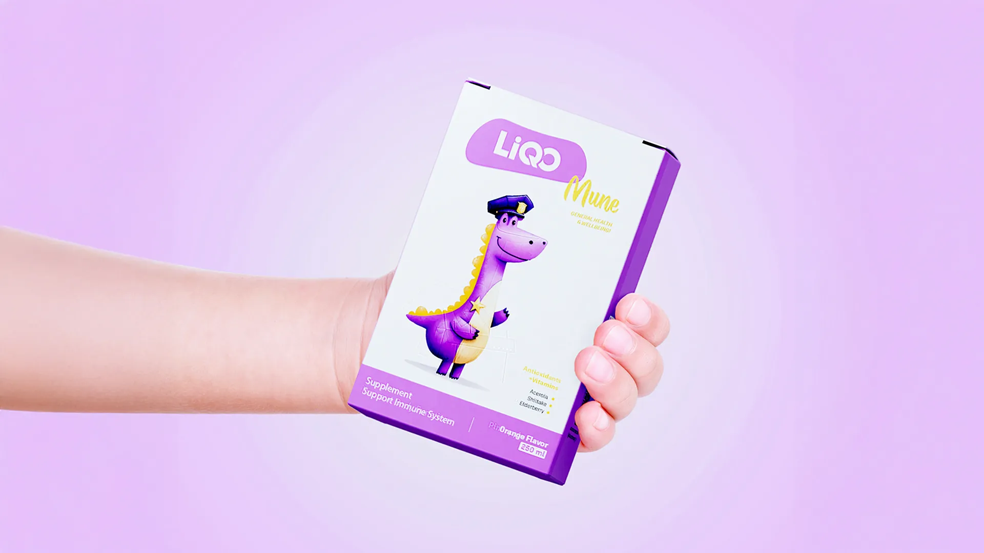
The intention
The aim was to make the interaction with the packaging feel more familiar and less intimidating for children. Each product has its own character while belonging to the same family.